Project Details
The majority of people who find the The Mighty do so by way of Google searches that lead them to articles which are interesting and/or relevant. It’s not necessary to be a Mighty member in order to read and many potential users never do join The Mighty (another topic altogether).
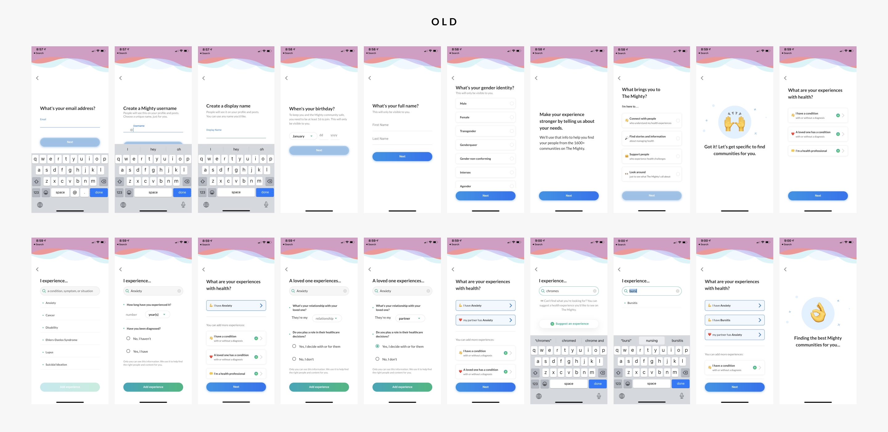
Once these ‘lurkers’ attempt to interact with articles though by liking, saving, or commenting, they are prompted to become Mighty members, a process that was awkward and cumbersome that less than 5% of prospective members successfully completed. It was imperative that The Mighty improve the rate at which people successfully completed their account creation process.
Approach
Mondo mapped out the existing account creation flow, noting all the spots at which we observed user drop-off, while simultaneously performing a heuristic evaluation which was intended to help identify the issues leading to the flow’s poor performance. Through these efforts a strategy was established and a set of requirements was created. The design process began in earnest.
Services Provided
User research
Product management
Product design
Native iOS design
Native Android design
Design QA
Problems and solutions
An arduous process

An abrupt transition
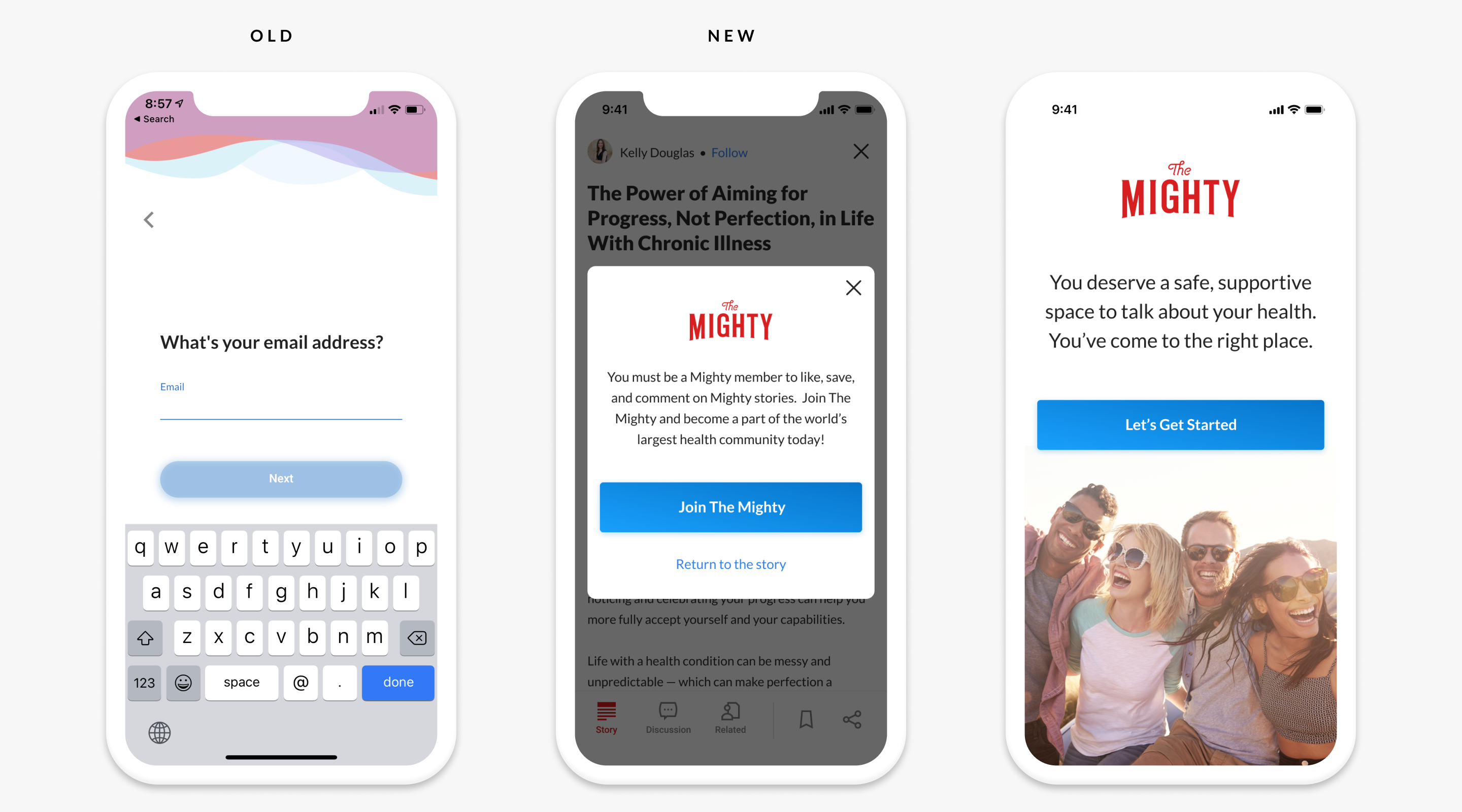
Any attempt by users to interact with an article by liking, saving or commenting abruptly navigated them away, without any warning or explanation, to the onboarding flow’s ‘What is your email address’ screen. It was a disorienting, contextless transition that didn’t set users up for account creation success.
The solution
A screen was introduced that explained the need to create an account which provided a much friendlier, more graceful transition to the onboarding flow. We additionally introduced a screen at the beginning of the account creation process explaining what is The Mighty and its value to prospective members.
An unintuitive user experience
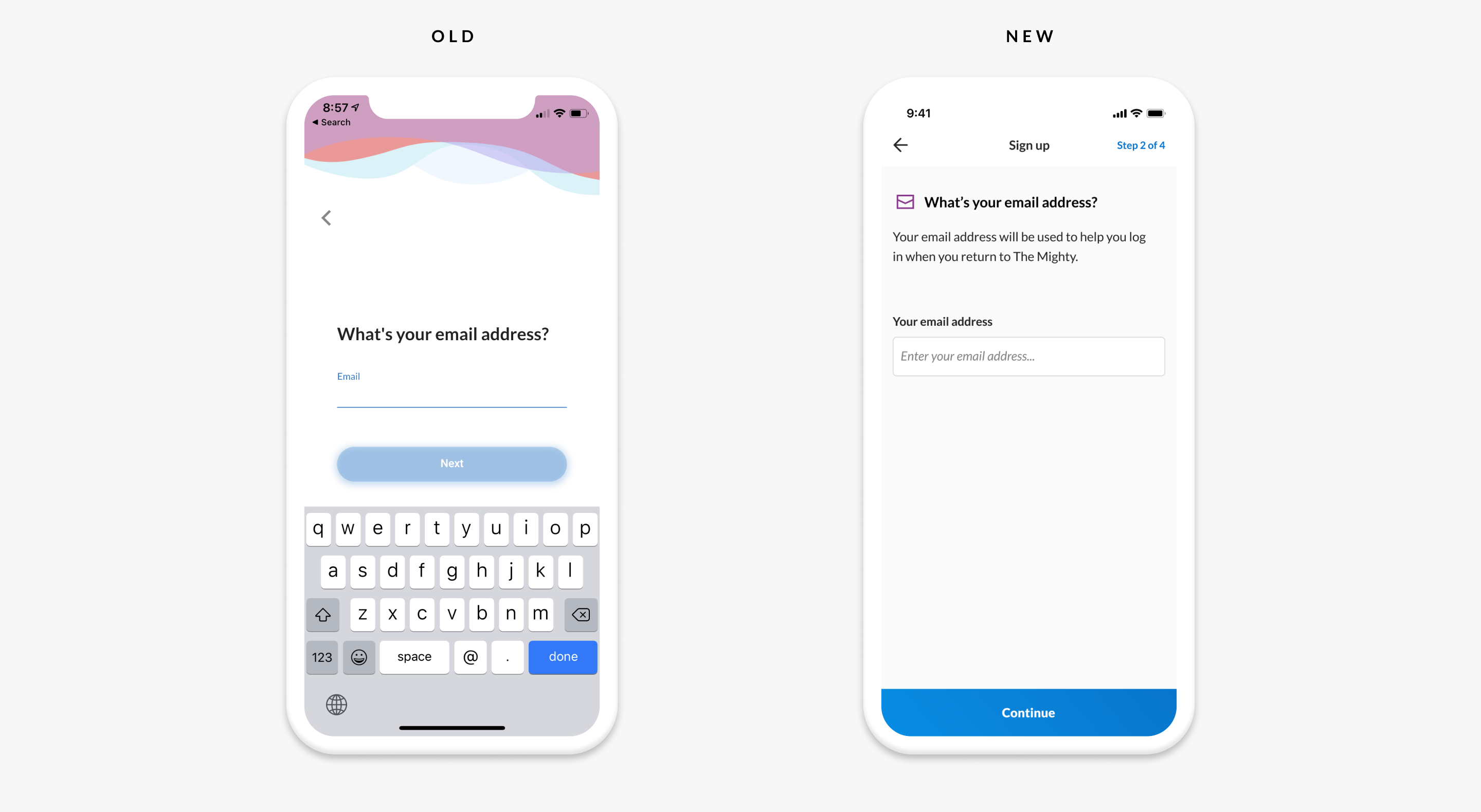
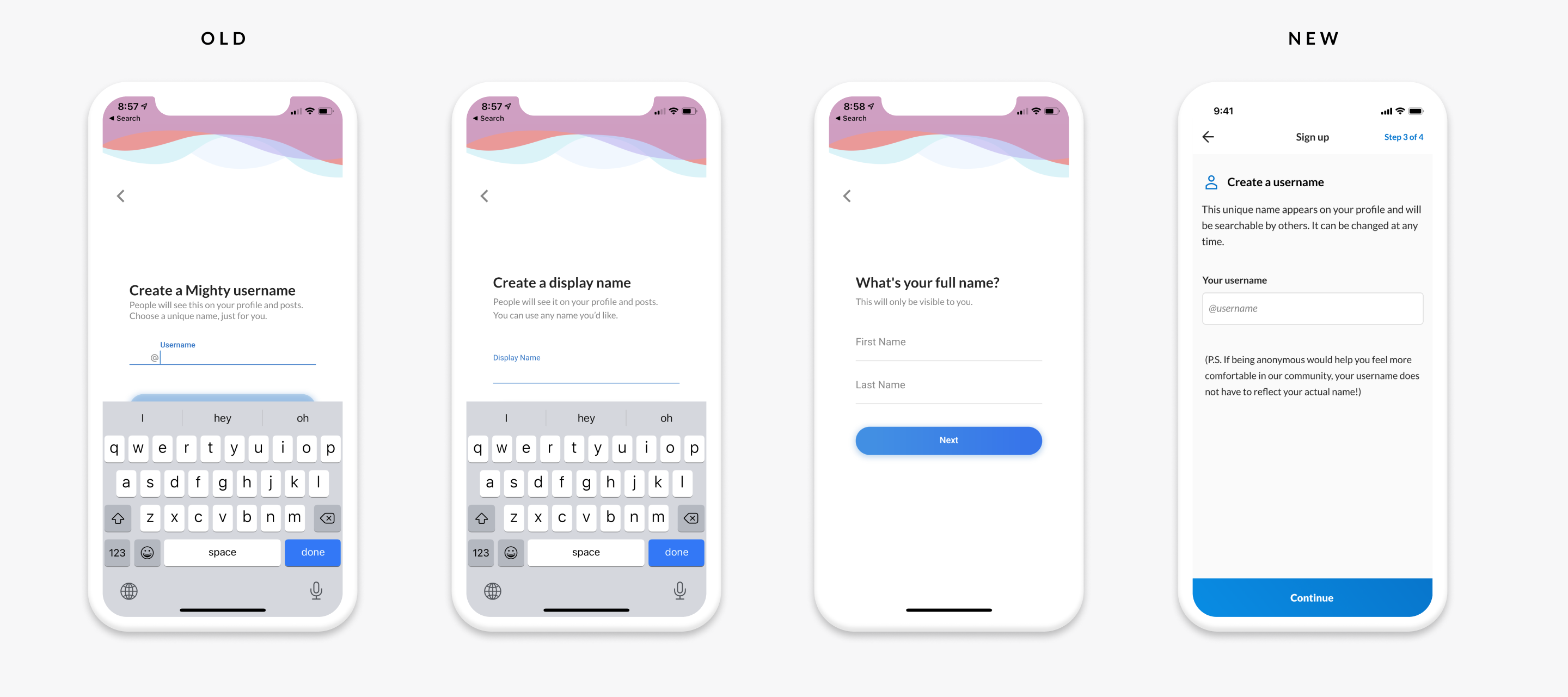
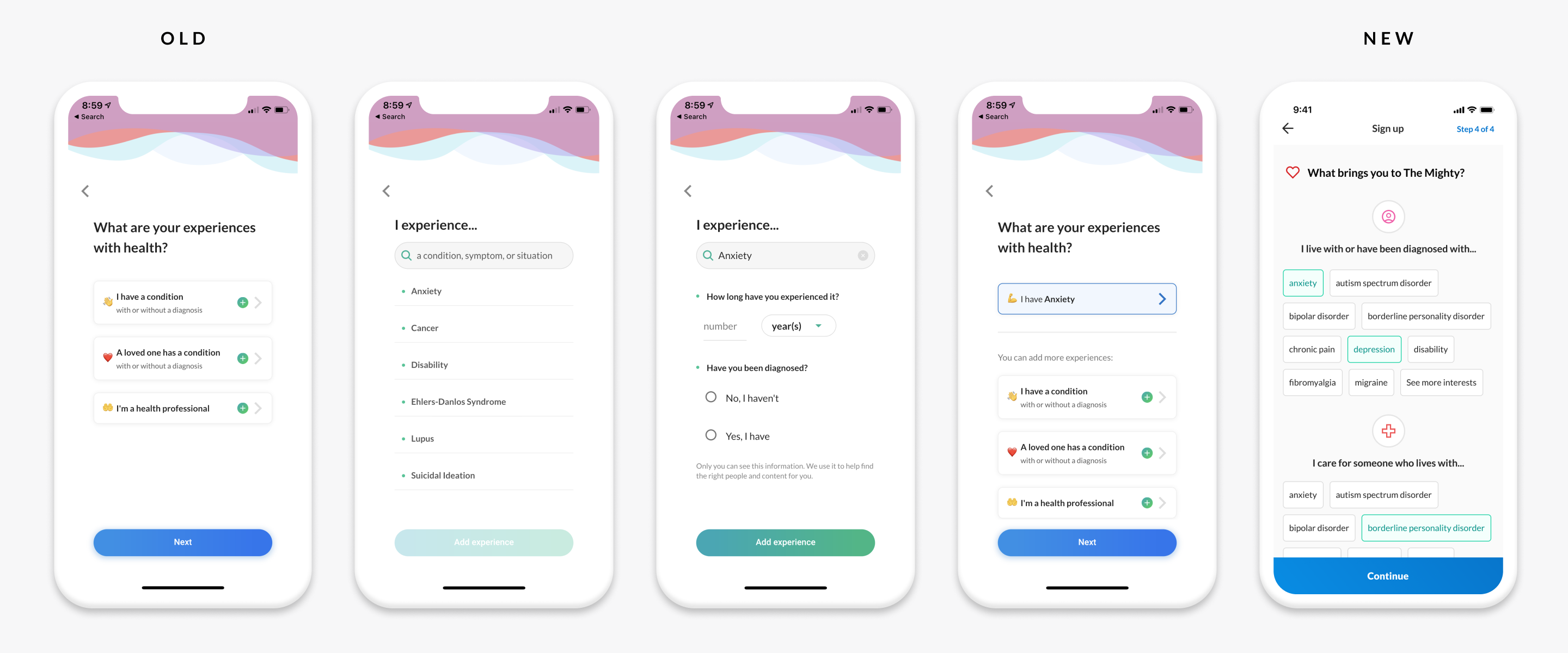
There were numerous screens in The Mighty onboarding flow seeking information from users that was confusing and/or seemingly redundant. Other screens failed to explain why certain information was being sought, giving users concerns about the privacy of their sensitive information.
An unintuitive user experience
By being purposeful about the information sought from users, only soliciting the most essential details, addressing privacy concerns and UI inconsistencies, and removing screens that offered little value and/or whose purpose was confusing, we were able to remove considerable friction, greatly simplifying the account creation process.

The outcome
The results of The Mighty’s account creation process’ redesign were dramatic. We removed over 15 screens from the original account creation process, the average time to completion dropped to under 30 seconds, and the completion rate rose to 83% (and is still improving). By any measurement, the redesign was an incredible success.

